
Design
Case Study for
K.R. BAKES
SOAN PAPDI
Context & Challenge
Balancing Festive Tradition with Modern Shelf Presence
Soan Papdi is a ubiquitous staple during Indian festive seasons like Diwali and Eid. However, the retail market is saturated with generic, loud red-and-yellow boxes that often lack visual refinement and brand differentiation.
Anatomy of the Redesign
the strategic decisions behind every element.
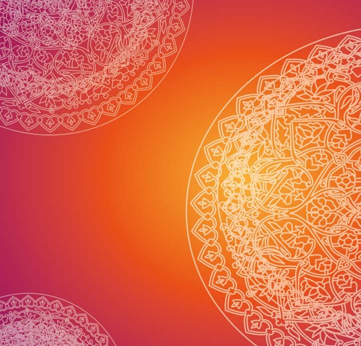
Background & Ornamental Design Elements
Cultural Motif & Geometry: Features intricate, circular mandala-inspired patterns and fine line-work floral motifs placed along the corners and edges to frame the composition.
Visual Framing: The overlapping circular geometry draws the viewer's eye inward toward the central product typography, creating a balanced and harmonious layout.
Color Psychology & Gradient: Utilizes a rich, vibrant gradient shifting from deep magenta-red to radiant orange-yellow, evoking warmth, celebration, and festive traditional Indian aesthetics.
Texture & Depth: Fine line styling against a smooth gradient background adds a subtle layer of sophistication without overpowering the primary brand title.
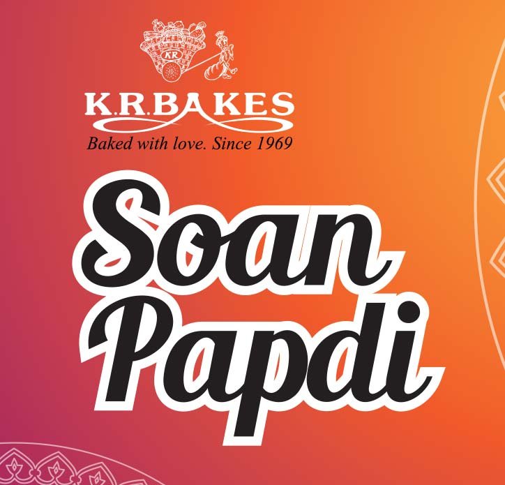
Typography, Visual Style & Design Strategy
Font & Style:
A bold, rounded script/display typeface featuring heavy strokes and a playful, approachable personality. The lettering is styled with a distinct white outer stroke to maximize contrast and legibility against the vibrant gradient background.
Visual Hierarchy:
The title is intentionally scaled large and centered to dominate the focal point of the packaging or promotional graphic, capturing immediate consumer attention.
Legibility Enhancement:
The thick white contour creates a necessary visual separation from the warm, shifting orange-to-pink gradient backdrop, ensuring the text remains crisp and readable at a glance.
Emotional Tone:
The friendly, soft curves of the typography bridge modern packaging design with the comforting, festive, and traditional essence of Indian sweets.
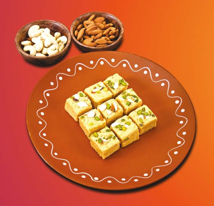
Product Imagery & Presentation Strategy
Visual Composition:
A top-down ("flat lay" style) studio shot featuring neatly arranged, flaky cubes of Soan Papdi garnished with nuts on a traditional terracotta plate , accompanied by wooden bowls filled with cashews and almonds.
Authenticity & Cultural Touch:
The clay plate features traditional white hand-painted folk patterns ( regional Indian folk art), anchoring the modern packaging in authentic, cultural roots.
Appetite Appeal & Texture:
High-contrast lighting highlights the fine, flaky texture of the sweet and the rich nut toppings, instantly communicating quality, freshness, and premium.
Role in Packaging:
Placed prominently as the primary visual anchor on the face of the box, bridging the gap between traditional homemade warmth and commercial appetite appeal.
Crafted for Sensory & Emotional Appeal
Every color hex and typographic weight was chosen to mirror the warmth of authentic ghee, roasted almonds, and festive joy.