
Architecting Luxury
Through Geometric Precision
The Brand
Luxury, expressed
through simplicity.
LINEN SQUARE is a luxury linen clothing brand celebrating refined simplicity and timeless style. The objective was to create a distinctive identity that captures the sophistication of premium linen apparel through a contemporary, elegant and versatile visual language, expressing exclusivity without excess.
The Challenges
Creating distinction through simplicity.
The challenge was to create a distinctive identity for a premium linen brand without relying on conventional luxury clichés.The identity needed to:
- Create a unique and recognisable brand symbol.
- Integrate the initial 'L' creatively and meaningfully.
- Explore the square as a representation of the brand name.
- Express exclusivity and understated luxury.
- Ensure versatility across clothing labels, tags,
packaging and digital platforms.The goal was to create more than a logo — a meaningful visual identity rooted in the brand name
Strategic
Solution
Building a brand around a simple geometric idea.
The creative direction translated the brand name and philosophy into a minimal, distinctive visual identity built around three key elements:
01. Letter 'L' – Brand Recognition
The initial 'L' was reimagined through geometric construction to create a unique brand symbol.
02. Square – Structure & Identity
The square forms the symbol's foundation, reflecting the brand name through balance, proportion and completeness.
03. Niche – Understated Luxury
The specialised linen apparel focus inspired a restrained, contemporary visual language that reflects refined clothing and timeless style.
The Logo
Concept
Building a brand around
a simple Geometric idea.
Where the letter 'L' meets the Square.
The concept merges the letter 'L' with a square geometric structure to create an abstract yet recognisable symbol.
+ Geometric Form: Reinterprets the letter 'L' through solid geometric shapes.
+ Negative Space: Uses the relationship between positive and negative space to reveal the letterform.
+ Distinctive Identity: Combines both elements into a clean, minimal and contemporary brand symbol.
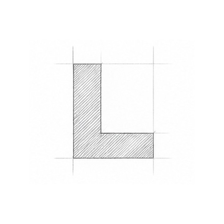
The
Initial
The letter 'L' was selected as the primary conceptual starting point, establishing a direct connection to the brand name.
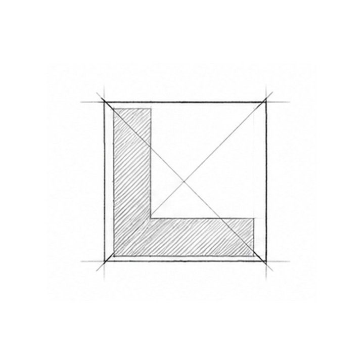
The Square Framework
A square geometry was introduced to establish the overall structure and proportions of the symbol.
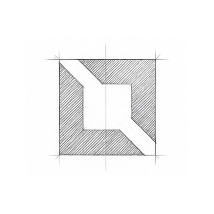
Negative
Space
The letterform was interpreted through the relationship between solid shapes and negative space.
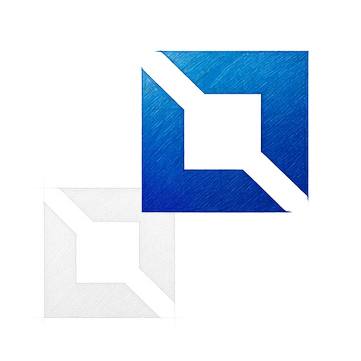
Refinement & Finalisation
Refined the geometry for balance, proportion and a distinctive final mark.
The Final
Identity
A unified brand expression.
The final logo brings together the geometric symbol, refined typography and the tagline rare is luxury.Each element has a clear role: the symbol creates recognition, the wordmark establishes the brand name, and the tagline communicates its philosophy.The overall composition is designed to feel balanced, distinctive and adaptable.
Press / Magazine / Online Release
Promotional and editorial brand visuals.
Shop
Applications
Promotional and editorial brand visuals.