Milma
Carrot & Dates
Pudding Cake
Redesign
Executive Summary
Milma expanded its value-added bakery and dairy offerings with the launch of the Carrot and Dates Pudding Cake. To ensure strong shelf impact, consumer trust, and clear product positioning against commercial competitors, a complete visual identity and packaging structure were developed.
Objectives & Challenges
Elevate Brand Perception: Modernize the packaging style while maintaining Milma’s heritage and brand recall.
Highlight Key Ingredients: Visually emphasize natural ingredients (fresh carrots and sweet dates) to appeal to health-conscious consumers.
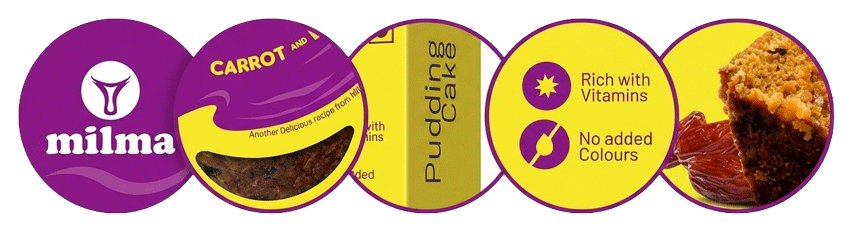
Communicate Value Propositions: Clearly feature key benefits such as "Rich with Vitamins" and "No Added Colours".
On-Shelf Differentiation: Stand out in crowded retail retail display cases using vibrant, complementary color block architecture.
Key Results & Outcome
Distinct Brand Identity: Successfully positioned Milma’s Pudding Cake as a premium yet accessible treat.
Enhanced Shelf Presence: High-contrast dual-tone layout significantly increased visual attention in supermarket aisles.
Cohesive Portfolio Alignment: Established a modular packaging design framework suitable for future flavor extensions.
Graphic Elements & Typography
Fluid Wave graphic: A smooth organic wave curve dividing the purple brand banner from the yellow product showcase area.
Custom Window Cutout: A crescent-shaped die-cut previewing the actual texture and color of the pudding cake inside.
Clean Sans-Serif Typography: High-legibility text hierarchy for quick reading of key product claims.