
Crafting Modern Heritage
A high-end brand architecture and precise typographic identity designed for the launch of ESMERALDI in the United Kingdom-fusing minimalist architectural geometry with the romance of haute joaillerie.
The Jewelery Brand
Crafting Modern Heritage
A refined visual identity developed for ESMERALDI, a contemporary jewellery brand launching in the United Kingdom. Combining architectural precision with the elegance of fine jewellery, the identity creates a distinctive expression of modern luxury and timeless sophistication.
Strategic
Positioning
ESMERALDI was envisioned as a contemporary luxury jewellery brand with a distinctive visual character. The design direction balances modern architectural simplicity with the timeless elegance and emotional value of fine jewellery.The objective was to create an identity that feels sophisticated, recognisable and adaptable across digital platforms, luxury packaging and physical brand experiences.
The Logo Concept
The ESMERALDI wordmark integrates a subtle diamond-inspired detail directly into its lettering, making the jewellery reference an intrinsic part of the identity rather than a separate symbol. Clean geometric forms, carefully considered proportions and distinctive letter modifications create a refined visual signature that balances simplicity with individuality.
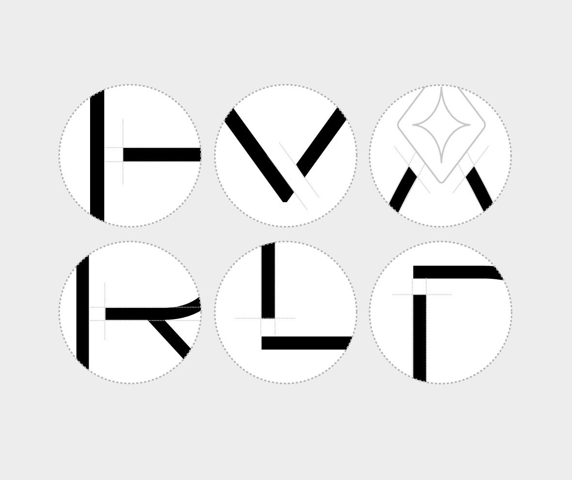
Negative Space Breaks
Strategic stencil gaps in the vertical stems of E, M, R, L, D, and I create light paths, giving the heavy sans-serif a weightless, gemstone-like transparency.

The Crown Spark 'A'
The letter 'A' is rendered as a clean chevron peak, topped with a four-point brilliant star flourish that symbolizes the sparkle of an emerald facet.
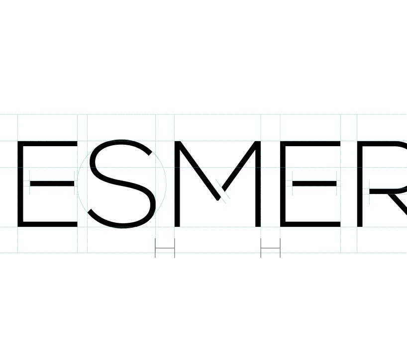
Extended Tracking
Set with a generous +320 tracking ratio to command presence across expansive Mayfair boutique window displays and luxury print media.
Precision Geometry
Every angle in the ESMERALDI logotype reflects gem-cutting faceting standards. The 60° chevron apex on 'A' matches ideal crown angles for stone brilliance.
Ethical Sourcing
Full traceability from Zambian and Colombian ethical mines, verified by London Assay Office hallmarking for absolute client trust.
Modern Heritage
Rejecting outdated ornate flourishes in favor of clean architectural stencil breaks that evoke contemporary British sophistication.
The Final Identity
The completed ESMERALDI identity brings together geometric precision, distinctive typography and understated luxury. Designed to work across both digital and physical brand touchpoints, the wordmark establishes a recognisable foundation for the brand's visual presence.